Followers

Monday, March 26, 2012

CRAP THEORY


While looking on the internet for inspiration, I came across this hilarious theory...CRAP. I mean, how much better can get it. This post and it's content is entirely from the Non-Designer's Guerrilla Marketing Guide by Robin Williams. Although this theory is short, it's informational and easy to remember. Plus, has some great points for people to remember when putting together a composition! I thought my viewers would enjoy this! :)


C.R.A.P


C= Contrast - Contrast draws your eyes to a page, it grabs your visual interest. Ways to create contrast: use two very different typefaces or use two very different line thicknesses or use two very different colors. The trick is to be strong. Don't be a wimp.


R= Repetition - Repeat certain elements throughout the piece. You might repeat colors, textures, typefaces, rules, dingbats, bullets, or graphic style. Repetition serves to unify a design.


A= Alignment - Make sure everything on your page is aligned with some other item on the page. Either line up the baselines, the right edges, the left edges, the tops, or the bottoms. If items are not aligned, then make sure they are really not aligned - don't almost align things. Thus, don't let a photo hang out a quarter-inch-- let it hang a whole inch.


P= Proximity - Refers to the spatial relationships between elements. The designer must keep appropriate items together. Thus, a subhead should be closer to the text below it than to the text above it; a caption should be close to its photograph. Remember that the space between items on a page gives the reader an instant impression of the content, even before the read the text


Thursday, March 22, 2012

TIPS FOR NON-DESIGNERS

So you're not the creative type, ehh? Well I hate to break it to you...Everyone has a creative streak in them. Some just know how to utilize it more than others...


If you're calling isn't in the design medium, yet you still want a little background, you're in luck! It's common for people who don't have design experience or training to make simple mistakes. Below are some helpful tips for non-designers to still be successful AND professional with any template or layout they're constructing.


1. Sometimes Less is a Little More


-This statement is in regards to all aspects of a design- type, graphics and clutter. A piece such as a resume, poster, business card, letterhead, banner, billboard ad, etc...will be more successful with controlled variety.

-Keep fonts to a minimum. Unless you're aware and can utilize several fonts, sticking to 2 or 3 is necessary for a non-designers.

-Color can be used for impact, but it doesn't have to look like a bag of skittles. Color can create contrast if utilized correctly, and minimizing to a few will do wonders and make that piece pop. (Kuler is an online website that offers fantastic color palettes!)


2. Centering Paragraphs? Just don't.


-Let's just be straight-forward and say that centering paragraphs looks cheezy, unprofessional, and just bad. Not only this, but it's also hard to read as well. Keep the centering aligning to headings, subheadings or professionals in general!


3.  Font Caps


-Decorative font can add a lot to a piece, but let's not get to out of hand here people. Script fonts (Ex: Edwardian Script) in all capitals looks tacky and difficult to read. Font that's larger in size to the other text on the poster obviously states it's more primary information, so you don't need to add it all in caps to make the audience aware.


4. White Space


-This blog site can't stress enough on how important composition is. The white space (negative space) in any design is just as important as the graphics or text as well. White space has a form and shape too, so utilize it! Non-designers have a tendancy to cram as much information onto a layout as possible. Refer back to tip #1 please and say it with me- "Sometimes less is more". One sentence or graphic can often have the same meaning as 10. Be selective and separate out primary, secondary and tertiary information.


5. Proofread. Proofread. Proofread!


-Spellcheck doesn't always cut it. There's a little more to design than that. If you go to the character tablet in any program you're working with, you can change things like leading and word spacing which can really enhance the body copy in your work!

-If have any text on the layout you're designing, read through it yourself to not only catch grammatical errors, but if it makes sense and SOUNDS professional! Read it out loud in fact...lol...but really, I promise it will help and you will catch even more errors this way as well.


Here are some not-so-great examples of design pieces. Can you see identify the mistakes after reading some of these tips?


Below are some books for non-designers to further assist knowledge in the adobe programs. You can search for these books and look at the ratings...Looks like a good find to me!!


Monday, March 19, 2012

DESIGNER'S BLOCK?


Being a designer has its challenges like anything else in the world today...especially if you're just beginning! There's a number of things that may cross your mind. Are you certain that your design is "correct"? Even if it is, is it on the right path? How is it in comparison to other peoples' work? Is it original enough? Creativity may be interrupted by insecurities. Confidence starts to wither away and designer's may pull back rather than taking risks that could turn into amazing pieces.


As a designer using any media, especially a beginner, you do not want to fall into this trap! Below are insightful tips of inspiration to provide knowledge on how to succeed, not fail in the design world.


1. Become Comfortable with Yourself and Your Work


     - Once you've required minimal knowledge, apply it.  For example, if your interest is logo design, practice often and market attributes. Don't hold back and don't be to overly proud or confident with yourself. If you have the skills and believe in yourself, spread your name. By doing this, it will not only market yourself, but you will get feedback. Like a critique in class, you take a risk (or you don't) and you get feedback on it whether it is positive or negative, it will help develop you as a designer. Don't be shunned by it, take the heat (if there is heat) and use it for what it's worth!

     -Be proactive in advertising. Show your skills off and market your work! Confidence, not cocky is the key, no matter how comfortable you are with your work. Visit Facebook and Twitter and share some photos of your lates work for example. Not enough?  Go to the next step and create a Linkedin profile or go to Weebly or Wix and create an online profile. These are just minimal starters to the possibilities that are out there! Become a brand that is comfortable, marketable and memorable.


2. Maintain a Balance


     -Always think outside the box, but have constraints. Take risks and avoid hesitation if it feels right. However, with saying this, find a sense of balance, and a positive attitude in relation to your skills as a designer. Success doesn't come easily. Yeah, yeah, we've heard all of those cheesy quotes in regards to failing first and eventually succeeding in the end. Well, it's true in the design world in a sense as well. So one of your designs wasn't as successful as intended? Retweek it, recreate it, revise it. Make it something completely different. This is how innovation is engineered...by recreating. Install imagination by bridging that balance within your attitude, beliefs, values and design work.


3. Learn From Others


    -Although it's encouraged and almost mandatory in today's world to be honest with your work, it's important to learn from others as well. Inspiration assists any designer no matter what stage they are in their career. Inspiration and knowledge is accumulative. You may like a certain picture here, a photo editing tip there, or a typography typesetting composition there. Like I said, the best of the best designers didn't get where they are today by sitting in a room by themselves with no access to the outside world for inspiration. They learn from others while applying their own knowledge and design styles. Learning from others will help you find a creative pulse. Don't isolate yourself, but don't copyright either (because you could go to jail...lol...but seriously). Reach out and embrace the beautiful artwork that's out use it to your advantage!


I hope these three inspirational spurts bumped your self esteem up a little! For all of you beginners out there, I've hit a designer's block many, many times...and still do! Don't become discouraged if your not the best, or aren't where you expected to be. Embrace.

Go to this website to check out some amazing inspirational ideas and creations from former designers! The range is endless from typography styles to animation to anything involved with CSS! -->
http://mashable.com/2009/03/16/design-inspiration/


Tuesday, March 6, 2012

CREATING LOGOS


-Logos are everywhere, whether it be for a business or a personal icon. It's recognizable and is what brands you or your business/company. Although commonly assumed, a logo may not always be an image. Today's exerpt is going to give you some tips to creating an effective logo.

-Illustrator is the easiest and most efficient Adobe program to create logos. It is simplest to 'illustrate' your logo using the pen tool, as well as adding any effects such as drop shadows, blends, blurs, filters, etc... This can be a frustrating program to use if one has never used it before. The MOST helpful website/tutorials I have found to use is below.  


This tutorial is fantastic to use for starting with Illustrator. It is structured and the lessons are divided into 4 weeks, but it's extremely easy to catch on and practice on your own time. You can also skip around to different lessons depending on your purpose and your speed of learning. Check it out to learn more!

This link has 5 different detailed tutorials site strictly for the pen tool:


-Scanning an image and playing with it on your default computer settings doesn't make the cut, guys. Below are examples of logos made through Illustrator to help create a professional and appealing logo for your need. 


1. Know Your Purpose:

A logo's intention is to brand the nature of your 'business'. The most efficient designs relate to what you do, your products, or what you have to offer. One wouldn't have the same logo for a night club and a non-profit organization...Well, let's hope not. Some examples of effective logos are below:


2. Always Brainstorm:

Next step is brainstorming an effective logo design. Think of an image that you or your business wants to portray to your audience. What is the 'mood' of your business? Where are you located? These are some questions to ask yourself and consider. Never hurry a brainstorm session either. "Good things happen to people who wait." Do some sketches and research online to get ideas!


3. Think of a Tagline:

What is a tagline you ask? A tagline is either a word or phrase that describes the company. It can be a motto or statement similar to your company or brand's mission statement. This creates a memorable jingle that pulls an audience in. Does "Just Do It", "Mmm, mmm, good" and "I'm lovin' It" sound familiar? Of course they do, not only does this associate with the logo, it also give the opportunity to incorporate the tagline in the design.


4. Be Original:

It's extremely important that your logo not only looks professional and represents your company, it's important that ir STANDS OUT! Come up with a design that isn't generic or similar to the competitors. If it isn't, there's no way to distinguish from the other logos that are in the same industry. Hence, be creative :). Some professional examples are below that caught my attention and I hope yours too!


5. The Three P's - Play. Practice. Perfect.

Yes...I did just make this up. The meaning of this, is that a logo isn't going to be perfect on the first try. It's going to take revision, trial and error, and outside critique to get the final product. 

  • Play around with the features and applications on Illustrator, (or any other program you're using) to see what effects there are! 

     *Remember, if you're not familiar, the beginning of this blog ^ has links to amazing tutorials to get        you started.

  • Practice using those features once you have discovered them. Just because you 'discovered' it once, make sure you know how to fully utilize the tool. Just like athletics, practice also makes perfect in the design world.


  • Perfect the applications you use and apply. Make sure there are no errors or glitches in the design. Sometimes the pen tool gets the best of me and I don't realize hanging points or uneven spacing. You want the end-product to be perfect. 


-Exploring fonts is also necessary and essential when designing a logo. A lot of logos have text of some kind (Doesn't necessarily need to). Make sure the fonts relate to the image and are proportional as well. Like stated in the previous blog, knowing the difference and relation between serif and san serif fonts is useful as well!


6. Make Your Logo Flexible:

The logo design that you are creating needs to be flexible so it can be altered and used in all mediums, files and forms. It should be adaptable so it can be spread across all cultures. Make sure it's going to relate to your company in the future, especially if it grows :). Below are just a few more examples that are inspirational to say the least. They have great quality, can be changed with file size, and relate to the company's intentions.


7. ATTENTION!

Below are some bad (and hilarious if I may say so myself) examples of logos. Please stand as clear as possible of making the same mistakes as these companies did...

Feel free to literally LOL.


Monday, March 5, 2012

ENHANCING DETAIL IN YOUR PHOTOS


-Now that we've learned a few basic principles and elements of graphic design in regards to composition, grid structure, elements and typographical composition, we can venture out a little bit and dive into some fun tips and pointers!

-I see the 'I've-always-wanted-to-be-photographer' in all of you...Okay, even if you don't there's still some great ways to really enhance photos whether you're printing them off to hang on your fridge, uploading to Facebook, using for a Christmas card, or for a design project (Yay!). There's always ways to make images look their best and improve the quality.

-An easy way to improve the visual effectiveness of a picture is to apply some techniques through Adobe Photoshop. If you don't own this program you can always download a 30-day trial from the Adobe CS5.5 website to try out before you purchase.

-If you've never used the program, check out this article for the easiest navigation and tips to get started--> http://mashable.com/2010/08/12/12-beginner-tutorials-for-getting-started-with-photoshop/


Some of the ways to improve the quality and visual appeal to a photo:


Saturation: Improves the colors the color in your picture
   1. open up the saturation editor (image->adjustments->hue->saturation) in Adobe Photoshop CS5.5 (or older versions if you have although navigation may be slightly different)
   2. Move the saturation slider to the right (15-25 points) to increase the overall richness of your image.
   3. If the picture has too much of a specific color, select specific CMYK to adjust it
   4. Changing the hue also creates an appealing look. You can change certain colors (blues or reds) to image a richer color


-Saturation and focus was utilized to make the colors on the parrot really stand out against the foreground!


Levels:
   1. Open up the levels editor (image->adjustments->levels)
   2. A graph will display the image data
   3. Move the right-hand pointer to the edge of the graph data to improve brightness quality without losing the picture effectiveness
   4. If you move the pointer closer to the graph data you wills tart seeing the quality decrease
   5. Utilize the left-hand pointer and glide toward the right so the dark colors are accentuated, but be careful
   6.The middle pointer changes the overall brightness (white balance) but this isn't something to play with carelessly. Only use if the quality of the original image is dark

-Practice makes perfect. Also realize that the color on screen is always different from the color when it prints, especially with a low-quality printer. The color is usually darker when on paper compared to the screen.


-Personal photograph of my newborn niece
-The image was originally dark, but by changing the levels to improve the brightness quality, the picture looks so much better!


Image Resolution: Number of pixels measured with color information within an inch
   1. Low resolution images look pixelated and lack detail. It can also come across as fuzzy and is hard and rarely used in larger templates and documents
   2.Super-high resolution can be used for large file sizes and need few adjustments to improve visual quality.
   3. Images should at least be 300 resolution (300 dots per inch) to utilize as an image
   4. Resolution and image size are inversely related
   5. The settings used during the 'capture' of an image (from a digital camera for example) determines base resolution...which is usually lower for people who aren't aware of those settings


Beware: Low quality images
   1. This appears in web images because it's good for quickly uploading. Do not directly download from the internet to use in a project without adjusting
       a. Also make sure that you're being legal about the situation if you are! Copyright is a huge issue!
   2. Do not print these images without editing and adjusting!
   3. The only way resolution and quality of an image can be improved is if the size is decreased or recapturing the image at a higher quality setting

-I hope some of these tips help with the use of images and editing them to get the best out of your photo or image! Below are also some tutorials if reading the information isn't quite grabbing your understanding. I introduced these tips and videos to my mom and now she's quite the little photographer herself :)


-Another personal photograph of my niece
-Editing utilized all tips in this post, plus some paint brush application (You'll get there!)


http://vandelaydesign.com/blog/design/photoshop-photo-editing/   --> I've used this site so many times!


-Watch this video ^ for more tips!


Sunday, March 4, 2012

TYPOGRAPHICAL COMPOSITION DO'S AND DON'TS

        -Some general issues to utilize and watch out for
        -Good and bad examples to illustrate tips


White Space: Work around holes and gaps in the middle of publications. This occurs when unnecessary or unappealing space appears between a headline or text with a separate graphic, text, or column. Adjust the size of the graphic or fill the space so that the negative space (white space) looks purposeful, attractive and readable.

Note: Sometimes making the white space dominant puts the focus on the intention of the message, which can also work in the intention's favor. See examples below.


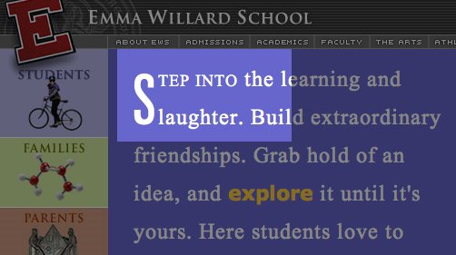
White space to focus attention on a single matter


A good and bad example of white space...


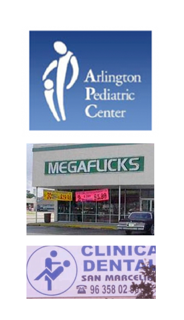
Similar Typefaces: Whether it be the same color, style, or font of a typeface, it's important to have a contrast when using more than one on a template. Underlining, bolding, or italicizing doesn't always create enough contrast and can create clutter and confusion, so be familiar with the choices of fonts available. It may also take more time for readers to separate the text if the typefaces are too much alike.


Too Many Typefaces: In regards to the previous tip of 'Similar Typefaces', it's important to not use too many as well. One should utilize texts for contrast, but using too many can have the same consequences of using typefaces that are too similar. Use enough to create contrast variation, but don't make the layout too busy and hard to comprehend.

Also be aware of sans serif and serif when choosing fonts to contrast! It needs to be visually appealing, yet make sense and readable. There are great typography links and tutorials listed at the end of the post to visit to get a better understanding.


-Cluttered and use of unprofessional text (Comic Sans)


Boxes and Rules: Avoid using headline and subheadings that are too close to other columns, texts, or boxes. Too many bordered elements on a page can be an overload and even harder to decipher. The result is clutter that interferes with the purpose of the easy-to-read aspect and purpose of any type of design.


Unequal Spacing: Strive for consistent spacing between text and graphics. Pay attention to the the relationship between the two for any grammatical or even appealing errors that could occur.

For example:
     -subheads and text
     -captions of artwork or images
     -columns starting and ending
     -the spacing between the information of text
     -text or graphics in relation to margins, borders, headlines and other text


-Personal example of a booklet layout
-Information is proportional and in relation to images
-Use of spacing between columns and variation of heading/subheading size and color makes it easy to read


Tabs and Indents: Default tabs in files should be changes to be proportionate and consistent throughout. It can be unappealing if it's not in relation to the text size, font or style on a template. Depending on which type of document or medium you are designing for, it may not even be necessary (classical book structure for example).


Cramped images, logos, and addresses: Information can be difficult to read because they may be squeezed by, together, or next to other information, just to get it on the page. No matter the layout you're designing for, if the information is on it, it has to have some importance. To avoid this, place the image, graphic or logo first and then place the important information next, and then build the rest of the document together/place the tertiary information last.

-Personal corporate system design example of text placed around a logo
-Text is easy to read and not cramped with the logo


Body Copy: Centered alignment of text is often difficult to read, especially on resumes, posters, word files, and website design. Flush left type is easiest to read, and is most often, the most appealing. To add a little style or change it up, there are such tools and differentiations of alignment. For example, left justified, right justified, forced and so on. This needs to be taken into consideration as well in the respect of the other objects, graphics and text surrounding the information


-Difficult to read, unappealing, centered text alignment


Headings, Subheadings, Tertiary Information: Utilize and create contrast based on the most important information that one wants to grab the attention of, to the tertiary information that can be read as the supporting text. Be sure to create this contrast by size, font style, or text difference. Also be sure that the headlines are subheads are closer to the text they are intended to represent or introducing. This can be weak if it's not immediately clear.


-Hard to distinguish which information is primary, secondary, or tertiary
-Drop shadow makes it difficult to read


     -->  Although these few tips can be utilized and transition between all medias and types of design, this is just the beginning! Below are some fantastic articles and sites to further your knowledge and skills in creating successful typographical composition layout for posters, business cards, website layouts, advertisements and more!